

Datacenter Map
Category
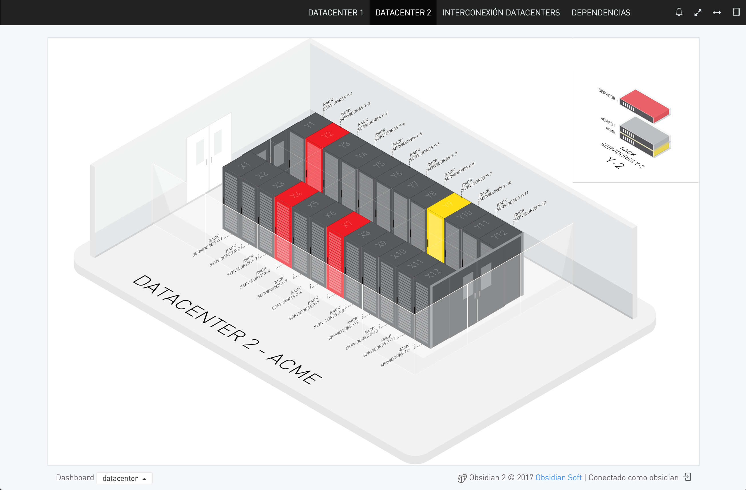
dashboard, dashboardEN, mapa, mapaENUsing Obsidian’s SVG image integration API for isometric representation of server racks within a data center cage.
Each rack displays the colour corresponding to the state of the worst server or infrastructure component it contains.
Server details are displayed to the right by hovering the mouse over each of the racks.
Hovering the mouse above each item also reveals a more complex transparency effect, enabling you to see the contents of each rack.
NOTE
All information shown in this image has been de-identified.