
Online isometric map editor
Obsidian offers an isometric map editor which allows you to create and edit a variety of different diagrams:
- Hierarchal process mapping, showing service statuses and service dependencies
- Infrastructure mapping, showing CI status (servers, clusters, apps, devices, etc.)
- Location maps representing the primary organization locations to any desired level of detail (building, floor, section, etc.)
Hierarchal maps
Once service modelling is complete, one of the most useful display features is the hierarchal value map which portrays dependencies between different services.
An Obsidian hierarchal value map allows you to visualize the status of each service, using green, yellow or red, each being associated to different map icons, to select any of the following criteria:
- Level of service availability
- Level of service capacity
- Quality of customer service support available from the service desk for services
- Quality of service level for each of the services
- Lowest level from the above criteria
- Lowest level from sensors and alerts associated to any CI of the service
The same hierarchal map, with different criteria, can be used in various dashboards. For example, using the vale for lowest sensor level in a technical dashboard, with the objective of identifying which services have pending incidents to be resolved, or using the value for service level in a dashboard for management.
A hierarchal value map also allows you to portray cause-and-effect relationships between the services. If an unavailability of a service were to affect another service, the line joining them would also be highlighted in yellow or red.
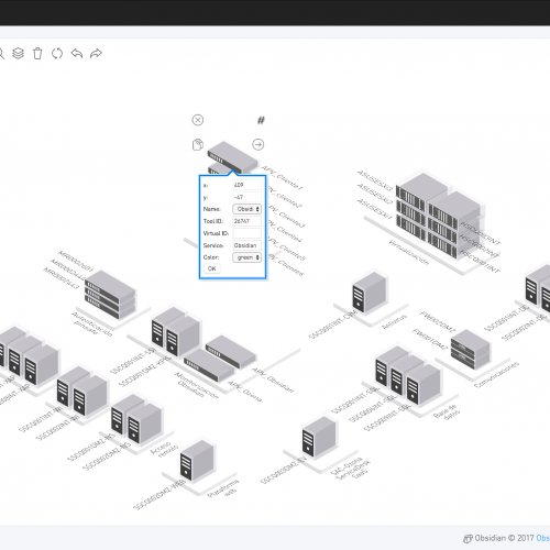
All isometric maps can be edited directly from the dashboard by using a combination of different keys to access the new isometric map editor.
This map editor enables you to do the following:
- Represent each of the different services in a configurable number of layers
- Represent dependencies between services with the use of arrows
- Export to SVG vector image format, converting arrows into isometric lines
- Automate integration of the final diagram into Obsidian dashboards
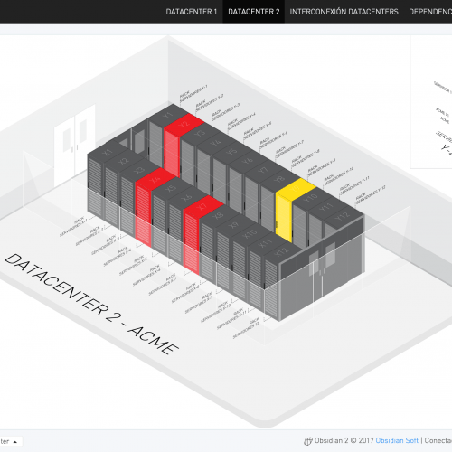
Infrastructure Maps
Obsidian’s isometric map editor also offers a specific mode for representing infrastructure maps.
Using the previously implemented model for adding service level values, it is also possible to associate any intermediate model node to the isometric map’s components, allowing you to visually represent service status, clusters and apps, etc.
As with the services, it is possible to portray each element of the map using its corresponding colour for the below:
- Level of availability
- Level of capability
- Lowest level from the above criteria
- Lowest level shown by sensors and alerts associated to any of the service CIs
All isometric maps can be edited directly from the dashboard by using a combination of different keys to access the new isometric map editor.
Additional Information
If you are interested in receiving further information about the online isometric map editor, or any of Obsidian’s other features, do not hesitate to get in contact via the following contact form.
NOTE
Only professional email addresses will be accepted. Any requests from Gmail, Yahoo, Hotmail or similar accounts will be ignored.
Personal data collected through this form will be used for the purpose of attending your request. You may exercise the right to access, rectification, and cancellation by applying in writing to Obsidian Soft, Av. General Perón 29, planta 16 · 28020 · Madrid.
[inbound_forms id=”1765″ name=”Obsidian”]